

|Articles|March 3, 2010
Bausch + Lomb introduces new logo, icon
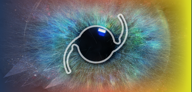
Bausch + Lomb has unveiled a redesigned company logo and icon. Both incorporate hues of the company?s traditional blue and green colors and introduce the plus symbol instead of the ampersand.
Advertisement
Rochester, NY
-Bausch + Lomb has unveiled a redesigned company logo and icon. Both incorporate hues of the company’s traditional blue and green colors and introduce the plus symbol instead of the ampersand.
“Our new corporate identity reflects the ongoing evolution of Bausch + Lomb as we make strides in growing our business for the benefit of medical practitioners, retail partners, consumers, and patients around the world,” said Gerald M. Ostrov, the company’s chairman and chief executive officer.
“Based on our strong momentum coming out of last year, as well as a number of planned new product launches and market initiatives over the coming months, we believe that 2010 will be a banner year for the company and the millions of people we’re so fortunate to serve each year,” Ostrov added.
The company will phase in the new logo and icon over time. It will co-exist with the former “pathways” logo for the next 18 to 24 months as product packaging and other materials are updated.
Advertisement
Related Content
Advertisement


Latest CME


Advertisement
Advertisement